
Table of Contents
How to Find a Font from an Image and Match It in Google Fonts
When you ask how to find a font from an image, you may need more than the original typeface name. A website, logo draft, presentation, Canva design, or app mockup often needs a free family that can be used immediately. The exact match may be commercial, custom, or unavailable, so the useful answer is often the closest production-ready alternative.
Google Fonts makes the replacement step practical: families are easy to preview, embed, download, and share with developers. Its search uses names, categories, weights, and filters, though, so it does not act as a complete visual reverse search for every screenshot or logo.
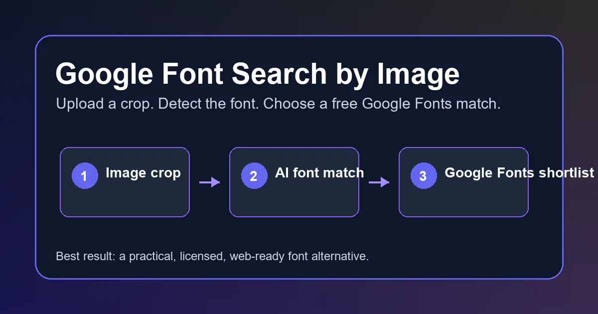
Use a two-stage process. First, run the image through a font detector to collect likely names and letterform clues. Then compare those clues with Google Fonts and test the strongest candidates in the real layout. This separates identifying the original font from choosing a free font that actually works.
Best mindset
Look for the closest usable Google Font, not always the exact original. A close match that is free, fast to load, and available in the right weights is often better for production than an exact font you cannot legally or practically use.
How to Find a Font from an Image: 5 Google Fonts Steps
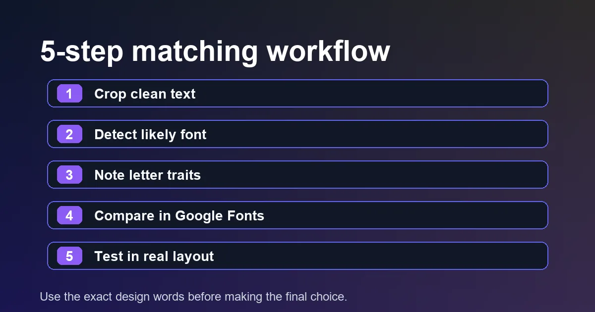
Use this font finder from image workflow for screenshots, logos, PDF crops, poster photos, social graphics, and client mockups.
- Crop the image to one clear word or short line. Remove icons, background clutter, shadows, and other fonts where possible.
- Upload the crop to Font Detector or another image-based font finder. Save several likely matches instead of trusting only the first result.
- Record the useful clues: serif or sans serif, width, contrast, x-height, the shape of a and g, terminal style, weight, and spacing.
- Search Google Fonts with the detected names and visual traits. Compare candidates at a similar weight and size to the source image.
- Test two or three candidates in the final headline, button, logo draft, or paragraph. Choose the one that works in context, not only in a preview.
How to Judge Whether the Google Font Match Is Good Enough
A visual match is not one single score. It is a set of small decisions. The table below gives you a reliable checklist for comparing a detected font with a Google Fonts candidate.
| Signal | What to compare | Why it matters |
|---|---|---|
| Skeleton | Look at a, g, e, R, S, and numerals. | These shapes reveal whether two fonts are built from the same visual logic. |
| Proportion | Compare width, x-height, ascenders, and descenders. | A font with the wrong width can break a layout even if the style feels similar. |
| Stroke contrast | Check whether thick and thin strokes change dramatically. | Contrast separates geometric sans, humanist sans, transitional serif, and display styles. |
| Spacing | Test the exact word or phrase from the original image. | Letter spacing and rhythm often decide whether a match feels believable. |
| Weights | Confirm the family has the weights used by the design. | A good match is less useful if it lacks the bold, italic, or variable range you need. |
Best Tools for Image-to-Google-Fonts Matching
No single tool covers every case. A strong workflow combines automated detection, manual comparison, and a final layout test.
- Font Detector: Use it first when the source is a screenshot, logo, flattened PDF, or image. It gives you font names and visual clues that make the Google Fonts search much faster.
- Google Fonts: Use the official library to filter by category, weight, width, script, and variable-font support after you know what visual direction you need.
- WhatTheFont or other identifiers: Use a second identifier when the first result feels wrong. Commercial-font results are still useful because they help you search for free alternatives by name.
- Browser DevTools: Use DevTools when the image came from a live website. If you can inspect the original page, the CSS font-family value is more reliable than visual matching.
Common Mistakes That Lead to Bad Google Font Matches
Matching only the overall mood
Two fonts can both feel modern and clean while having very different letter shapes. Check the lowercase a, g, e, uppercase R, numerals, and punctuation before deciding.
Ignoring weight and optical size
A 700-weight heading compared with a 400-weight preview will look wrong even when the family is close. Match the weight, size, and line-height before judging.
Forgetting language coverage
A great Latin match may not support accents, Japanese, Korean, Cyrillic, or other scripts your project needs. Always check language coverage before handing the font to developers.
Using a display font for long text
Some Google Fonts look excellent in a logo but become tiring in paragraphs. Use display fonts for headings and choose a more readable companion for body copy.
How to Use the Google Font Match on a Website
Once you pick the closest Google Font, test it with the exact text from the design. If the original image uses tight logo spacing, you may need letter-spacing adjustments. If the source is a website mockup, also compare line-height, font-weight, and fallback fonts. Small CSS values often explain why a correct family still looks slightly off.
For production websites, load only the weights and styles you need. A common mistake is importing every weight just because Google Fonts makes it easy. Fewer weights usually mean faster rendering and less layout shift. If the headline only uses 600 and the body uses 400, start there.
If privacy or performance requirements are strict, talk with your developer about self-hosting the selected font files instead of calling the hosted CSS from Google. The right choice depends on the project, but the design decision should come first: confirm the font match, confirm the license and coverage, then decide how to load it.
Production note
Keep the original detected font name, the chosen Google Font alternative, the tested weight, and a screenshot of the comparison in your handoff. That gives designers and developers a clear reason for the choice.
Frequently Asked Questions
References and useful sources
Last updated: August 13, 2026
Back to Font Detector