Serif vs Sans Serif: What Is the Difference and Which Should You Use?
A practical comparison of letter anatomy, readability, brand tone, print and screen behavior, with a repeatable way to choose rather than relying on a design myth.
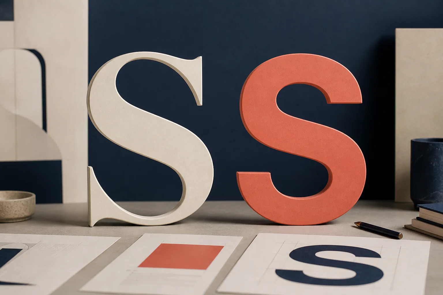
Serif vs Sans Serif: The Visual Difference
A serif is a small finishing stroke attached to the end of a letter's main stem. Look closely at a traditional face such as Georgia, Garamond, Baskerville, or Times New Roman: the feet on a capital I, the terminals on a lowercase n, and the brackets where strokes meet are visible clues. Serif is a category, not one visual style. Old-style, transitional, Didone, and slab serifs can feel warm, formal, dramatic, or sturdy even though they share terminal strokes.
Sans means without, so a sans serif typeface removes those conventional finishing strokes. Helvetica, Arial, Inter, Roboto, Futura, and Source Sans are familiar examples, but this category is equally varied. A geometric sans can feel engineered, a humanist sans can feel open and friendly, and a grotesk can feel neutral or institutional. Calling every sans serif modern and every serif traditional hides important differences between individual designs.
The fastest identification method is to inspect the ends of letters such as I, l, E, T, n, and h. Then look beyond the serif itself: compare stroke contrast, aperture, x-height, width, bowls, terminals, and the shapes of a, g, R, and Q. Those details often affect tone and legibility more than the category label.
- Serif: terminal strokes are visible; stroke contrast may range from subtle to dramatic.
- Sans serif: terminals are generally plain; construction may be geometric, grotesk, or humanist.
- Slab serif: heavy, block-like serifs create a stronger and less delicate voice.
- Semi-serif and flare-serif designs sit between the categories, so classification is not always binary.

Serif vs Sans Serif Comparison at a Glance
Use category as a useful starting point, not a verdict. The table summarizes common tendencies, while the final column shows what to test before deciding.
| Aspect | Serif tendency | Sans serif tendency | What to verify |
|---|---|---|---|
| Anatomy | Finishing strokes at terminals | Plain or simplified terminals | Inspect I, l, T, E, n, and h |
| Typical tone | Editorial, literary, established | Direct, functional, contemporary | Judge the individual family, not the stereotype |
| Long-form text | Strong tradition in books and publishing | Common in digital articles and documentation | Test size, line length, spacing, and weight |
| Interface text | Can work in refined or editorial products | Common default for controls and labels | Check small sizes and character distinction |
| Display use | Ranges from classic to dramatic | Ranges from neutral to bold and geometric | Check line breaks and available weights |
| Pairing | Adds texture and contrast | Adds structure and visual quiet | Give each family one stable role |
Serif vs Sans Serif Readability: Which Is Easier to Read?
There is no universal winner. The familiar rule that serif is always better for print and sans serif is always better for screens is a convention, not a reliable law. Serifs have a long association with books and newspapers, and many serif text faces were engineered for sustained reading. Sans serif faces became common in interfaces, signs, and early digital displays because their simpler forms held up at small pixel sizes. Modern high-resolution screens can render both categories well.
Readability describes how comfortably someone can process continuous text; legibility describes how easily individual characters can be distinguished. In both cases, the exact design matters. A generous x-height, open counters, clear differences between I, l, and 1, sensible letter spacing, and well-drawn bold and italic styles can make either category successful. A fashionable face with tight spacing or extreme contrast can fail even when its category appears appropriate.
Context changes the result. Body copy at 17 pixels and a comfortable line length behaves differently from a twelve-pixel label, a road sign viewed at distance, a glossy magazine headline, or a paperback printed on absorbent paper. Test the real words, weight, size, line height, contrast, and output device. Include accented characters, numerals, punctuation, and every script your audience needs.
Accessibility guidance should be treated as a complete typography system rather than a category command. Users benefit from adequate text size, strong color contrast, sufficient spacing, predictable hierarchy, and the ability to zoom or override styles. If an audience includes readers with low vision or dyslexia, conduct user testing and avoid claiming that one font family solves accessibility by itself.
When to Use Serif or Sans Serif Fonts
The best default depends on the communication job. Start with the likely category below, then validate the actual face rather than treating the recommendation as a restriction.
| Use case | Useful starting point | Test before launch |
|---|---|---|
| Book or long print article | Text serif designed for small sizes | Paper, ink spread, line length, italics |
| App or dashboard | Open humanist or neutral sans serif | Labels, numerals, density, low-resolution states |
| Editorial website | Either; many systems mix both | Mobile paragraphs, loading, headings, language fallback |
| Brand or logo | Choose by personality, not category | Distinctiveness, small reproduction, licensing |
| Wayfinding and signage | Clear sans serif is a common default | Distance, lighting, confusing character pairs |
| Invitation or luxury campaign | Display serif or refined sans serif | Thin strokes, print method, accessibility |
How to Choose Between Serif and Sans Serif in Five Steps
A short type specimen test produces a better decision than choosing from a logo mockup or a single large word.
- Define the job and audience. List the medium, viewing distance, expected reading time, languages, emotional tone, and whether the text is a headline, paragraph, label, data point, or call to action.
- Create two small candidate groups. Select two or three serif families and two or three sans serif families with the weights, italics, numerals, symbols, and language coverage the project requires.
- Set identical real content. Compare a headline, two paragraphs, a list, a button, a caption, numbers, punctuation, and difficult character pairs at the same optical size—not merely the same numeric point size.
- Test constraints. Review mobile line breaks, low contrast conditions, zoom, fallback fonts, slow font loading, inexpensive printing, and the smallest size the design will actually use.
- Choose by evidence and document roles. Record the family, weights, size range, line height, measure, fallback stack, and which elements use it. A repeatable system is more valuable than a category slogan.
Can You Use Serif and Sans Serif Together?
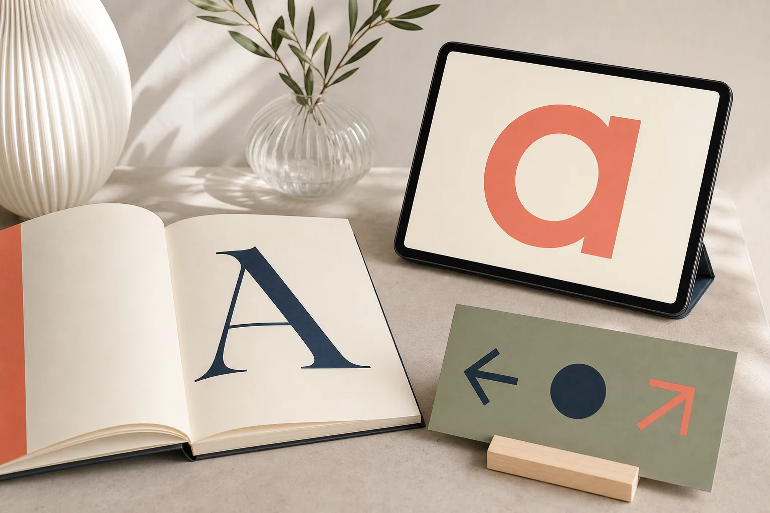
Yes. Pairing a serif with a sans serif is one of the clearest ways to create hierarchy. A distinctive serif headline can give an editorial voice while a neutral sans serif handles paragraphs and interface labels. The reverse also works: a firm sans serif headline can organize the page while a readable serif brings warmth to long-form copy.
The pair still needs a relationship. Compare x-height, width, stroke rhythm, round shapes, punctuation, numerals, and overall energy. Assign each family a stable role instead of switching unpredictably. If both faces are expressive, they may compete; if both are nearly identical, the second family adds loading cost without creating useful contrast.
A superfamily such as Noto Serif and Noto Sans can simplify multilingual work because the designs share proportions and broad script coverage. Two unrelated families can be more distinctive, but they require stronger testing across languages and fallback states.
Common Serif vs Sans Serif Mistakes
Choosing by stereotype
A serif is not automatically trustworthy, and a sans serif is not automatically modern. The specific drawing and context create the impression.
Testing only a headline
Display success does not prove that paragraphs, tables, forms, captions, or mobile navigation will remain readable.
Ignoring optical size
Two fonts set to 16 px may look different in apparent size because their x-heights and proportions differ.
Using category as accessibility proof
Accessibility depends on the full system, including spacing, contrast, zoom, hierarchy, language, and character distinction.
Forgetting font licensing
A font discovered in an image still needs the correct desktop, web, app, or commercial license before production use.
Ignoring fallback behavior
Missing scripts or slow font loading can replace a carefully chosen family with a mismatched system font.
Use the Right Tool After You Choose a Category
If you are starting from a screenshot, upload it to the font detector. When you need a second family, follow the font pairing guide. To audit a live website's computed type size, use the font size detector.
Serif vs Sans Serif FAQ
What is the main difference between serif and sans serif?
Serif typefaces have small finishing strokes at letter terminals; sans serif typefaces generally do not. Both categories contain many substyles, so the terminal is only the first distinction.
Is serif or sans serif better for reading?
Neither is universally better. The individual design, size, weight, spacing, line length, contrast, medium, and reader matter more than the category alone.
Should websites use sans serif fonts?
Sans serif is a common interface default, but a well-designed serif can work beautifully on modern screens. Test real paragraphs and controls at desktop and mobile sizes.
Is Times New Roman a serif font?
Yes. Times New Roman is a transitional serif typeface. Georgia, Garamond, Baskerville, and Merriweather are other familiar serif examples.
Is Arial a sans serif font?
Yes. Arial is a sans serif. Helvetica, Inter, Roboto, Open Sans, and Futura are other well-known sans serif families.
Can I mix serif and sans serif fonts?
Yes. Give each family a clear role, such as serif headlines and sans serif body text, then compare their proportions, mood, punctuation, language coverage, and fallback behavior.