Font Pairing Guide: 12 Best Font Combinations for Websites
A practical method for choosing headline and body fonts that feel intentional, remain readable, and work across real website layouts.
The Four Rules of Font Pairing
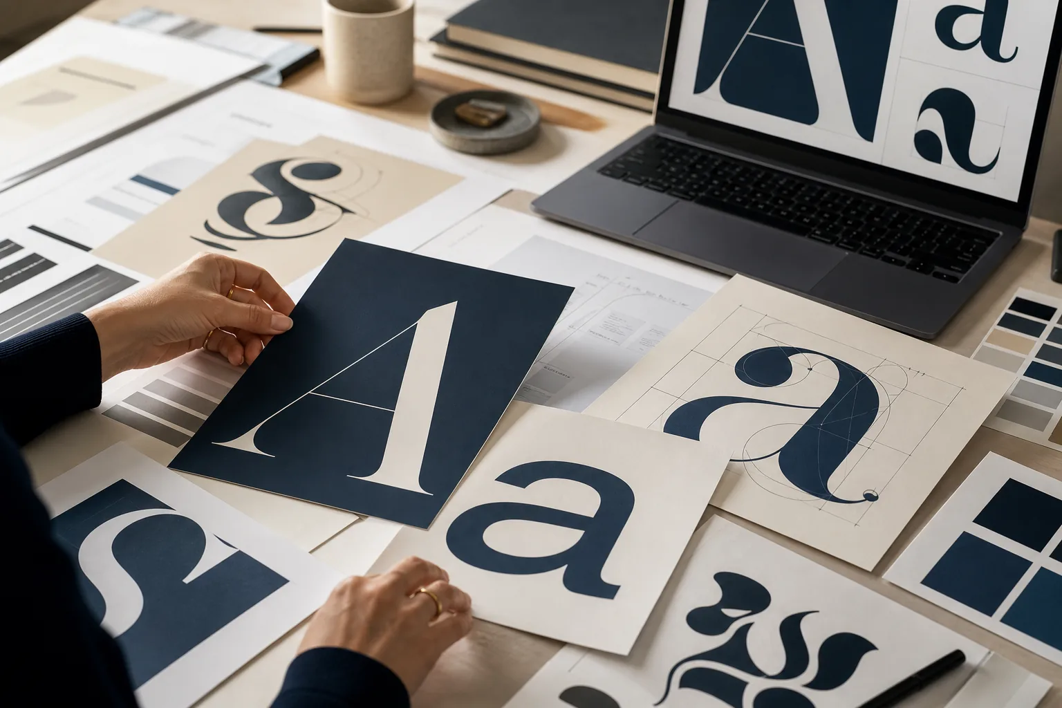
A font pair should create hierarchy without making the page feel like two unrelated brands. A high-contrast serif headline can work with a quiet sans serif body because the roles are obvious. Two nearly identical sans serifs are harder to justify unless their weights, widths, or functions are clearly separated.
Before choosing names, define the jobs. Most websites need a display or heading face, a body face, and a fallback stack. Navigation, buttons, captions, labels, and data can usually reuse one of those families.
- Contrast category, weight, width, or personality—but do not contrast everything at once.
- Look for compatible x-height, letter width, stroke rhythm, numerals, and punctuation.
- Assign one family to headings and one to long-form reading before adding exceptions.
- Test real paragraphs, mobile line breaks, bold text, italics, and every required language.
12 Reliable Font Pairings to Start With
These combinations are starting points, not rigid formulas. Brand tone, available weights, loading budget, and language coverage still decide the final choice.
| Font pair | Style | Best for | Why it works |
|---|---|---|---|
| Playfair Display + Source Sans 3 | Editorial serif + neutral sans | Magazines, beauty, portfolios | Strong headline contrast with calm, readable body text. |
| DM Serif Display + Inter | Expressive serif + UI sans | SaaS editorials, landing pages | Distinctive titles above an interface-friendly body. |
| Merriweather + Open Sans | Readable serif + humanist sans | Blogs, education, nonprofits | Open, friendly forms with clear role contrast. |
| Lora + Roboto | Contemporary serif + versatile sans | Guides, product stories | Warm headings with efficient paragraphs and controls. |
| Libre Baskerville + Montserrat | Classic serif + geometric sans | Professional services, culture | Historical authority meets modern structure. |
| Cormorant Garamond + Work Sans | High-contrast serif + clean sans | Luxury, fashion, hospitality | Elegant display detail balanced by direct copy. |
| Bodoni Moda + Manrope | Fashion serif + modern sans | Premium campaigns, lookbooks | Dramatic headlines with clean digital text. |
| Fraunces + IBM Plex Sans | Soft variable serif + technical sans | Creative technology, studios | Personality with unmistakable functional roles. |
| Oswald + Source Sans 3 | Condensed sans + neutral sans | Sports, events, dashboards | Compact headings and comfortable body text. |
| Space Grotesk + Spectral | Modern grotesk + literary serif | Startups, research, newsletters | Technical energy meets editorial depth. |
| Poppins + Lora | Geometric sans + warm serif | Lifestyle, courses, creators | Approachable headings and rhythmic reading. |
| Noto Sans + Noto Serif | Superfamily sans + serif | Multilingual, content-heavy sites | Shared metrics and broad language coverage. |
A Five-Step Font Pairing Workflow
A repeatable process is more reliable than choosing from a screenshot of trendy combinations.
- Start with the content and three useful brand adjectives such as precise, warm, editorial, technical, or playful.
- Pick the harder role first: a distinctive headline voice or a highly readable body face.
- Compare structure at the same optical size, including x-height, round letters, terminals, numerals, punctuation, and bold weight.
- Build a small type scale using real headings, paragraphs, a button, a form label, and a data row.
- Test desktop, mobile, slow loading, fallback rendering, accented characters, and every required locale.
Best Font Combinations for Websites
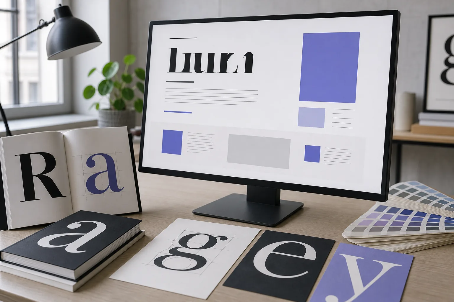
Website pairing adds constraints that print samples hide. A display face may create poor mobile line breaks, lack a useful semibold, or add too much download weight. Body copy should remain comfortable around 16–18 pixels with generous line-height.
Load only the styles the page uses, define robust system fallbacks, and verify that both families cover the same scripts. Otherwise the visual relationship can disappear when fallback fonts take over.
Common Font Pairing Mistakes
Too little contrast
Two similar sans serifs often look accidental.
Too much personality
A decorative headline and decorative body compete.
Testing only the hero
A pair can fail in tables, forms, long paragraphs, or mobile headings.
Ignoring language coverage
Missing characters can switch to unrelated fallback fonts.
Using too many weights
Start with regular, semibold, and bold.
Replacing spacing with fonts
Tune line-height and measure before discarding the pair.
Tools for Finding Compatible Fonts
If you already know one typeface and need a visual neighbor, use our font matcher. If your starting point is a screenshot, identify the original first with the Google font search by image guide.
Font Pairing FAQ
What is the best rule for pairing fonts?
Use controlled contrast: make the families different enough to create hierarchy, but compatible in proportions, mood, or rhythm.
Should headings and body text use different fonts?
Often yes, but one superfamily with contrasting weights and widths can also create a cleaner system.
How many fonts should a website use?
Two families are enough for most sites. Add a third only for a specific functional role.
Can I pair two serif fonts or two sans serif fonts?
Yes. Increase contrast through width, weight, construction, or historical style.
What makes a font pairing accessible?
Readable body size, sufficient contrast, stable line-height, clear emphasis, and robust fallbacks.
How do I pair fonts for multiple languages?
Choose families with matching script coverage and test real translated content in every locale.