
Table of Contents
Prepare an Arabic Image Before You Search for the Font
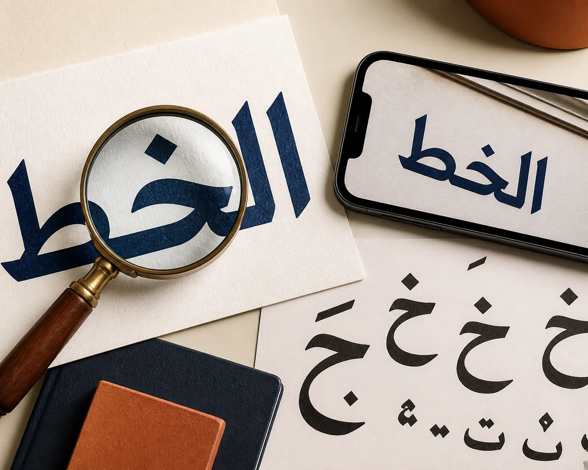
The quality of the source image usually matters more than the wording of your search query. If you are trying to identify an Arabic font from a poster, logo, menu, book scan, storefront sign, social graphic, or phone screenshot, start with the clearest version you can find. A flat, front-facing crop gives an image font finder better evidence than a full scene with shadows, icons, and unrelated text.
Arabic lettering adds a few complications that are easy to miss. Letters connect differently depending on their position in a word, dots distinguish many characters, and short vowel marks may sit above or below the baseline. A crop that cuts off dots, joins, or diacritics can make two unrelated fonts look similar or can hide the strongest clues.
Do not redraw the sample before detection. You can make a copy with higher contrast or a plain background, but keep the original image as a reference. Excessive sharpening, perspective correction, or manual tracing may create shapes that were never present in the source.
- Crop tightly around one word or a short line, leaving a small margin around every dot and connecting stroke.
- Prefer a horizontal, high-resolution sample with dark text on a light background.
- Remove logos, borders, icons, English subtitles, and decorative textures that are not part of the Arabic lettering.
- Keep a second crop if the image contains both regular letters and diacritics; each can reveal different font details.
- If the text is photographed at an angle, correct the perspective gently but do not stretch the letterforms.
The Six-Step Arabic Font Finder Workflow
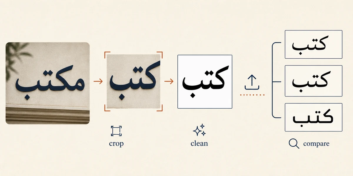
This workflow covers the common search intent behind “find Arabic font from image” and the close variants “Arabic font finder from image” and “Arabic font detector from image.”
- Choose the strongest sample: Select one Arabic word or line with enough connected letters to show the font’s rhythm. Avoid a single isolated character unless it has distinctive dots or terminals.
- Make a clean crop: Remove the background, neighboring scripts, and decorative elements while preserving all dots, joins, diacritics, and the original proportions.
- Create a contrast copy: Try a simple dark-on-light version if the source has gradients or shadows. Keep the untouched original so you can check that the cleanup did not change the shapes.
- Upload the image: Use an image font finder such as Font Detector to upload the crop and review the returned likely matches. The system is comparing visual evidence, not reading the Arabic sentence as a translation task.
- Compare more than the first result: Test the same word in two or three leading candidates. Check the dot geometry, joins, stroke endings, width, and spacing instead of trusting a familiar font name.
- Confirm the practical choice: Decide whether you need the exact family, a close alternative, or simply a readable font for a mockup. Then check the foundry or library for licensing and available Arabic glyph support.
How to Read and Verify Arabic Font Matches
An Arabic font detector normally returns a shortlist because many typefaces share the same broad skeleton. The best result is the candidate that stays consistent across several letters and positions, not the one whose preview has the closest overall mood. If the source is a logo or display treatment, expect a close match rather than a guaranteed original font.
Use the exact Arabic word from your image when you test candidates. Replacing it with an English sample or a different Arabic phrase can hide differences in joining behavior, baseline movement, and the shape of contextual forms. If you have a longer line, compare one short word first and then check the full line for spacing and rhythm.
A font name is only one part of the decision. Check whether the family contains the Arabic characters you need, whether the weight matches, whether the font renders correctly in your software, and whether the license allows your intended use.
| Signal | What to check | Why it matters |
|---|---|---|
| Dots | Shape, count, size, angle, and distance from the main stroke. | Dots often separate similar Arabic characters and expose a family’s drawing style. |
| Contextual joins | How the same letter enters and leaves a connection at the start, middle, and end. | Arabic forms change by position, so joins reveal whether the skeleton is truly similar. |
| Stroke contrast | Thick-thin balance, terminals, curves, and sharp or soft transitions. | Contrast helps distinguish calligraphic, text, and display-oriented families. |
| Diacritics | Placement, weight, shape, and spacing of marks above or below the line. | A match that ignores marks may fail on real Arabic content. |
| Width and rhythm | Overall word width, baseline movement, spacing, and repeated shapes. | The exact word often exposes differences that a generic font preview hides. |
Arabic Script Clues That Help You Identify a Font
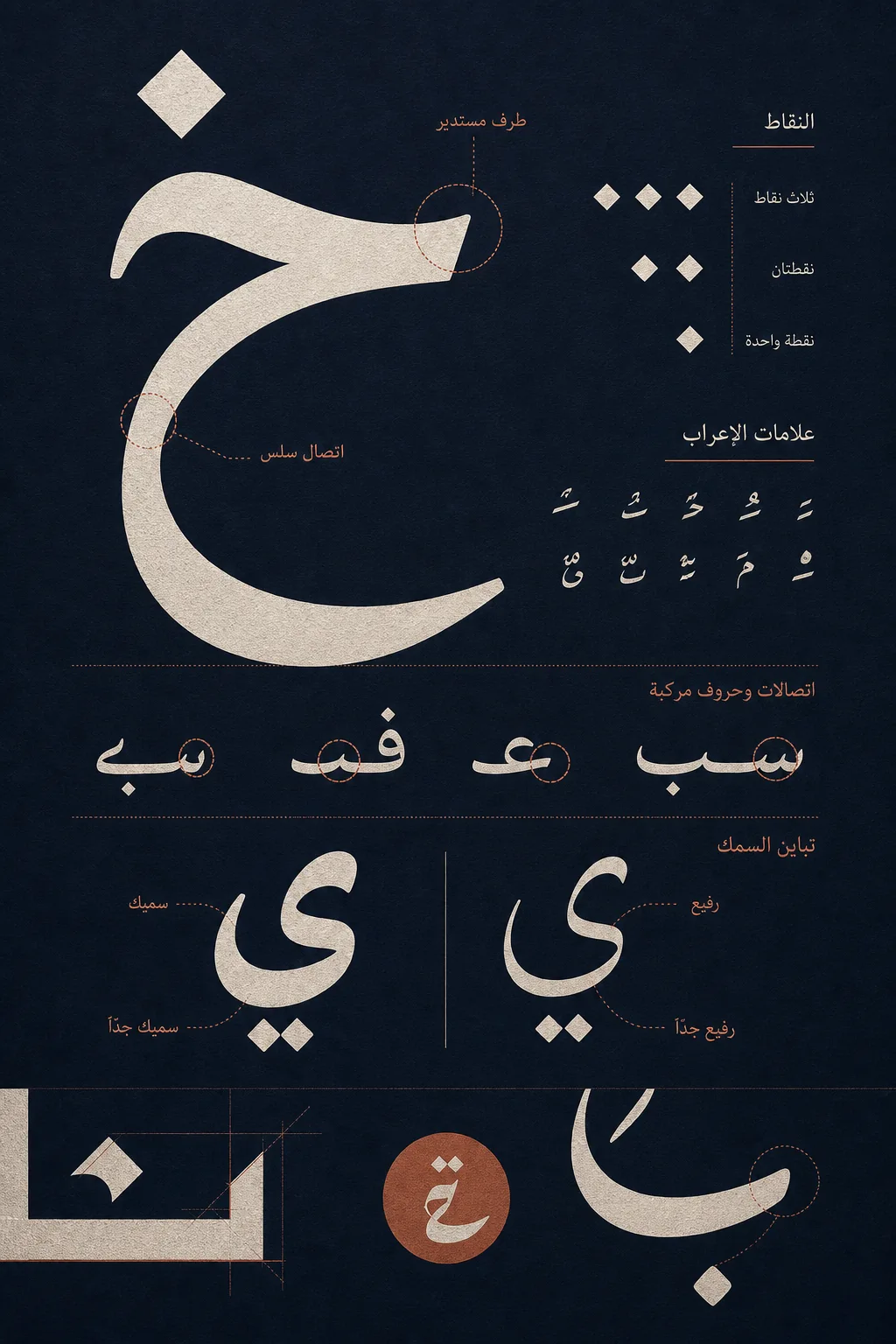
Dots are among the fastest visual clues. Compare their shape, size, angle, and distance from the main stroke. A font may use round dots, diamond-like dots, or compact marks, and the difference can remain visible even when the connected skeleton looks familiar.
Next, inspect connections and contextual forms. The same Arabic character can change shape at the beginning, middle, or end of a word. Look at how the stroke enters and leaves a connection, whether curves stay soft or become geometric, and how the baseline rises or falls across the word.
Finally, compare stroke contrast, terminals, and diacritics. Naskh-influenced designs often show a different balance of thick and thin strokes from a geometric or Kufic-inspired display style. These labels are helpful categories, not proof of the font name; use them to narrow the shortlist before you verify the letters.
What to Do When an Arabic Font Detector Fails
The crop is too small
Find a larger source, export the original design again, or capture a higher-resolution screenshot. Enlarging a tiny JPEG cannot recreate details that were never recorded.
Dots or diacritics are missing
Try another word from the same image or use the original uncropped file. One missing dot can remove an important distinction between Arabic characters and fonts.
The lettering is custom or heavily edited
Treat the result as a starting family. Logos and headlines often modify terminals, joins, spacing, or individual letters after the original typeface was chosen.
The result is readable but not exact
Compare a few similar families manually, then choose the closest licensed alternative for your project. A useful replacement is often better than an unsupported promise of exact identification.
Tools and Next Steps
Use the workflow that matches the source. An image font finder is the right first step for a flattened Arabic screenshot, logo, scan, or photo; other sources may need a different method.
- Font Detector: Upload a clear Arabic crop to get likely font matches and similar typefaces. This is the fastest starting point for image-based identification.
- Fontspring Matcherator: Use another image-matching result as a comparison point when the first shortlist is uncertain. Availability and Arabic coverage can vary by font library.
- Font Squirrel Matcherator: Try a second matcher for difficult samples, especially when you want to compare free-font options after the visual analysis.
- Manual verification: Open the font family in a design or typography tool, paste the exact Arabic word, and compare dots, joins, weight, and spacing at a useful size.
Frequently Asked Questions
References & Sources
Last updated: August 7, 2026
Back to Font Detector